Contents
Comparing performance
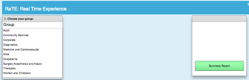
To get an overview of performance for multiple services, click the green Summary Report button on your Home Screen.
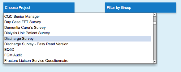
Clicking this button will present you with the following options:
- Firstly you will need to Choose a project that you wish to explore.
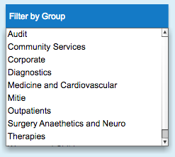
- You can then optionally decide whether you want to filter this report to by particular a group, or look at the results for the entire organisation. To do this, use the Filter by Group option
Viewing a Summary report
There are three ways of viewing data in a Summary report. They can be view as bar charts, pie charts and in a tabular format.
Below are the primary tools needed to define a summary report.
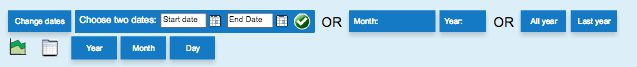
As well as the Choose project and Filter by group options, you now have the option to Change dates to refine results to a particular period of time, download the report as a PDF document, Reset the the Summary Report to it’s default settings and Exit the report at any point.
![]()
You can use the Choose dates area to view results between the dates chosen. You must press the green tick icon to confirm the chosen dates.
Alternatively, you can select a specific year and month using the date shortcuts displayed above.
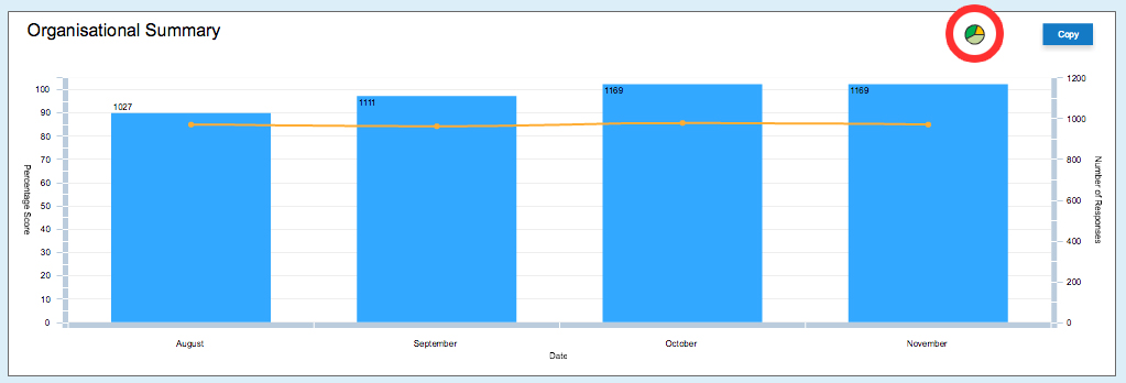
The progress bar chart view
This is the default view for any summary report. It is the best way to track organisational progress over time. You can click the Copy button at the top right of this view to save the image for print or presentation. Clicking the pie chart symbol will take to the pie chart interpretation of the report. Click here for more information on the pie chart view.
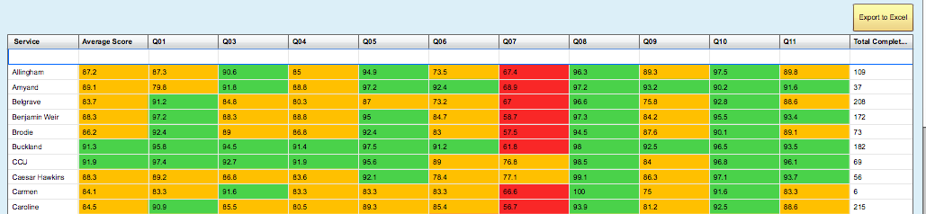
The tabular view
This view gives a break down of numbers for each service. The report can be exported as a spread sheet to Excel at any moment by selecting yellow Export to Excel.
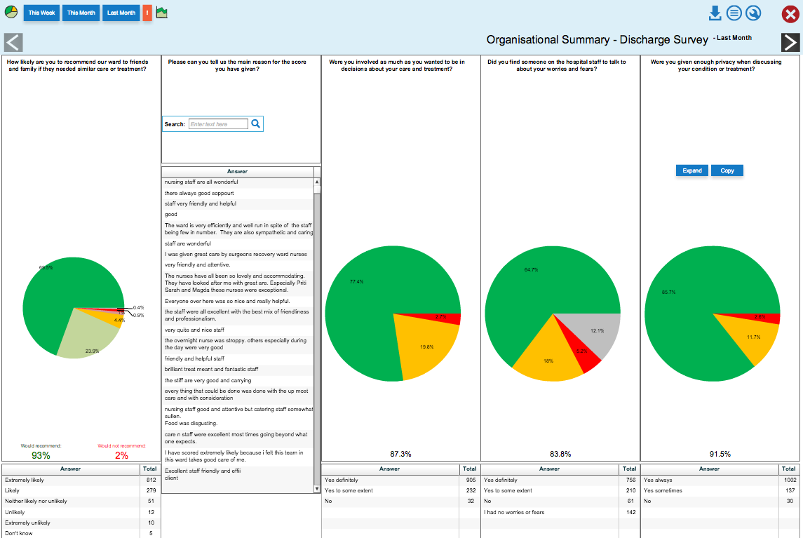
The pie chart view
The pie chart view gives a breakdown of how each question was answered. For more information on the Pie chart view, please visit the Individual Service Reports page.